
Perfecting a microanimation
Summary
Role
UX designer
The challenge
Say Insurance, a young online-only car insurance company, had a brand promise to make auto insurance transparent, simple, and friendly. To deliver on this, Say developed a feature that allowed users to learn about a little-known but important rating factor called the insurance score.
The insurance score is similar to a credit score but looks more at the customer’s behavior towards their finances (e.g. on-time payments) more than looking at the finances themselves (e.g. placing a lower value on the size of the payments). My research with users showed they were interested in learning more about the insurance score and specifically about how it affected their rate. I knew we had a problem when site analytics showed poor performance on the insurance score feature despite this known user interest. I took on the challenge of understanding the gap between users’ intent and behavior and how to bridge it with a solution that met our brand promise.
Outcomes
The insurance score, when paired with the rate reveal instead of living outside of the quote flow, offered valuable insight to users and bolstered our brand promise according to user feedback. It also allowed us to leverage score ranges as a user ID attribute that could be analyzed for marketing purposes. This project also helped define the motion language for Say.
Getting started
Understanding the problem
I started by focusing on already available research, and found two insights based on earlier interviews and site analytics that puzzled me. Users expressed interest in knowing their insurance scores and how it affected their rate, but the few that used the insurance feature abandoned it. Digging deeper, I found it unsurprising that the drop-off came when we asked a question about the last four of their social security number.
Design
Location, location, location
I knew I needed to get around the SSN question, so I collaborated with underwriting and legal teams to come up with a way to show users the range that their score fell into without having to ask for their social.
I decided to rely on progressive disclosure and only introduce the insurance score concept in relation to the rate, since that’s the reason why users were interested in learning more about the insurance score in the first place. To better couple the insurance score with rates, I decided to integrate the insurance score feature onto the rate reveal page in the quote flow instead of its former position outside of the quote flow. Once I had an idea about where the insurance score fit in the user journey of a prospect coming to Say’s website for a quote, I focused on design solutions that would be clear but minimal so as not to distract the user from moving on to purchase a policy since that was the overarching business goal for the user in this scenario. The design needed to be responsive, adhere to our design system, and show the insurance score in relation to the rate.
I worked with pencil and paper through multiple versions and iterated with feedback from stakeholders and the design team until I landed on a tab and folder design that met the criteria. I created mid-fidelity versions in multiple sizes and hallway-tested them before moving into high-fidelity.
I also learned more about the insurance score during this process, and realized it needed to be shown in relation to the rate but shouldn’t appear to be the primary factor impacting the user’s rate. If I was going to create valuable and accurate insight into the rate, I needed to communicate about other important rating factors like age, the number of cars, and marital status since those factors could have bigger impacts on the rate than the insurance score.
Implementing the animation
When I presented the designs, the front-end team was skeptical about the animation, having never implemented anything like this before. I found an example animation and CodePen samples that I used to communicate the idea in terms of code. This helped give the engineers a starting point and helped overcome the initial resistance to adding animation into the tab and folder design.
I worked closely with the engineer to figure out pacing details and the interaction during the implementation sprint. UX content was also heavily involved as we tried to keep the copy as clear and brief as possible, which was difficult to do with an abstract concept. During our collaboration, we worked with support staff to try out different analogies with callers to see which ones clicked when a support agent answered questions to users about insurance scores. This also helped support staff understand the insurance score better themselves. I learned that prior to this project, many of the support staff misunderstood the score’s relationship to rates (it is complicated, even for insiders) and some had been trained to compare the insurance score to getting a blood test, which doesn’t paint a pretty mental model.
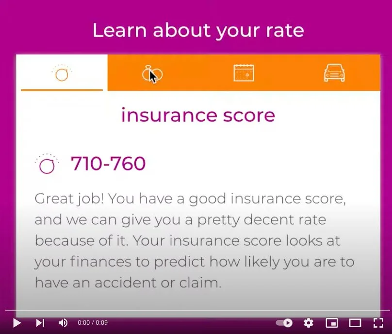
A video showing the animation between the tabs for each rate factor. To make this a little more interesting to interact with, I worked with engineering to add the pacing change depending on how far away the icon was from the cursor.

Desktop design of the insurance score in context on the rate reveal page.
Impact
The insurance score, when paired with the rate reveal, offered valuable insight to users
Bolstered our brand promise of transparency about auto insurance
Allowed Say to leverage score ranges as a user attribute that could be analyzed for marketing purposes
Helped define the motion language for Say
Learnings
Disconnects between user behavior and user intentions are a great place to look for interesting experience problems
In this case, prototyping in code together with an engineer was faster than developing a version in a tool like Principle. Knowing what would be the most efficient for the people involved is better than relying on a specific tool in every instance.