
Fixing a front-line problem with a mobile-friendly design
Summary
Role
UX designer and researcher
Challenge
Say Insurance is a start-up, online-only auto insurance company within Shelter Insurance, a large traditional insurance provider in the Midwest. A few years after launching, a persistent pain point had emerged: the difficulty of editing an in-progress auto insurance quote.
The original quote had been designed so that when a user received their rate, they couldn’t go back to edit any previous answers. This was increasing call-time and frustrating users and support staff alike. This frustration was expressed to UX in the form of a request to build a separate quote web app, just for the power users on the support staff. But was that really the best solution to the problem?
Outcomes
Once implemented, this project resulted in improvements to call times in the support center, UI improvements to address user feedback and resolved technical and design debt.
Getting started
Preliminary research
I started tackling this issue by understanding the problem and its history. I learned why the quote had been built that way in the first place and what problems editing the quote would actually solve. Why did people need to edit their answers? What situations were they in? Why were answers being changed while on the phone with a support representative? To answer these questions, another UX designer and I spent time performing contextual inquiry interviews with support staff and management, shadowing support staff, and listening in on customer calls.
We came up with a healthy list of viable reasons that an edit capability would better meet overlapping users and support staff needs more than building a costly second web app. I also learned that changing the editing capability of the quote would mean refactoring the entire underlying backend structure. This would involve changing calls to various other systems, APIs, and services that affected many engineering teams.
Design
Cross-functional kick-off
Because of the scope of the issue, I planned and executed a design sprint with the help of my team’s scrum master. With representatives from front and back-end engineering teams, UX, product owners, marketing, and support, we worked through the full five-day protocol and came out with a wall full of over 300 post-it notes from the usability tests, a user-tested prototype, and a list of revisions to inform the next iteration. I created the prototype and lead the five usability sessions.
Our big idea involved creating a hub-and-spoke flow paired with an interactive progress bar. As a user worked through each question of the quote and purchase flow (the spokes), they would see a recap page (the hub) before moving to the next category. On the recap page, we would surface the provided information and allow in-line editing. If the user wanted to go back and make edits to earlier categories, they could navigate quickly to other recap pages using the interactive progress bar.
In designing the recap pages, I was inspired by Material Design, WCAG 2.0, and the interaction of sliding cards on the Gmail sign-in page. Our users were primarily accessing the quote on mobile devices, but there were quite a few desktop users, so designing a responsive quote flow was key.
As I worked closely with my product owner and engineering team to move forward in this refactor, a design system effort simultaneously kicked off within the larger UX team. Engineering and UX were growing, and we needed a scalable way to efficiently communicate, manage inconsistency and increase velocity. We evaluated every component in use, eliminated the unnecessary patterns, weighed accessibility options, and documented decisions.
Using the brand’s existing colors and components, I quickly created a mobile prototype to test during the design sprint with an interactive progress bar and the hub-and-spoke idea for forward and backward movement in the quote flow.
Testing
The interactive prototype that I created and tested during the sprint validated the hub-and-spoke concept. The next challenge in refining the iteration was quote storage and retrieval. We knew from previous research that this was something users and support agents both wanted: the ability to move forward and backward in a quote and to pause and return later. Figuring out where they should be dropped back into when they returned and how we would save information was a massive engineering-UX collaboration over several white-boarding sessions and design iterations.
As we began to codify our colors and their usage in the design system effort, another UX designer and I began tinkering with a new color scheme for the quote flow. Previous remote unmoderated research showed that the original magenta background within the quote flow was controversial. Some loved it, some hated it, and some didn’t even notice it. One usability test participant said she wouldn’t move forward in the quote specifically because the colors made her not trust the company.
Another UX designer and I tested a several different versions of the progress bar, and in the tight real estate of a mobile screen, additional iconography did not help increase users’ understandings of the feature. I whittled the progress bar down until landing at the classic linear dot view.
Final design
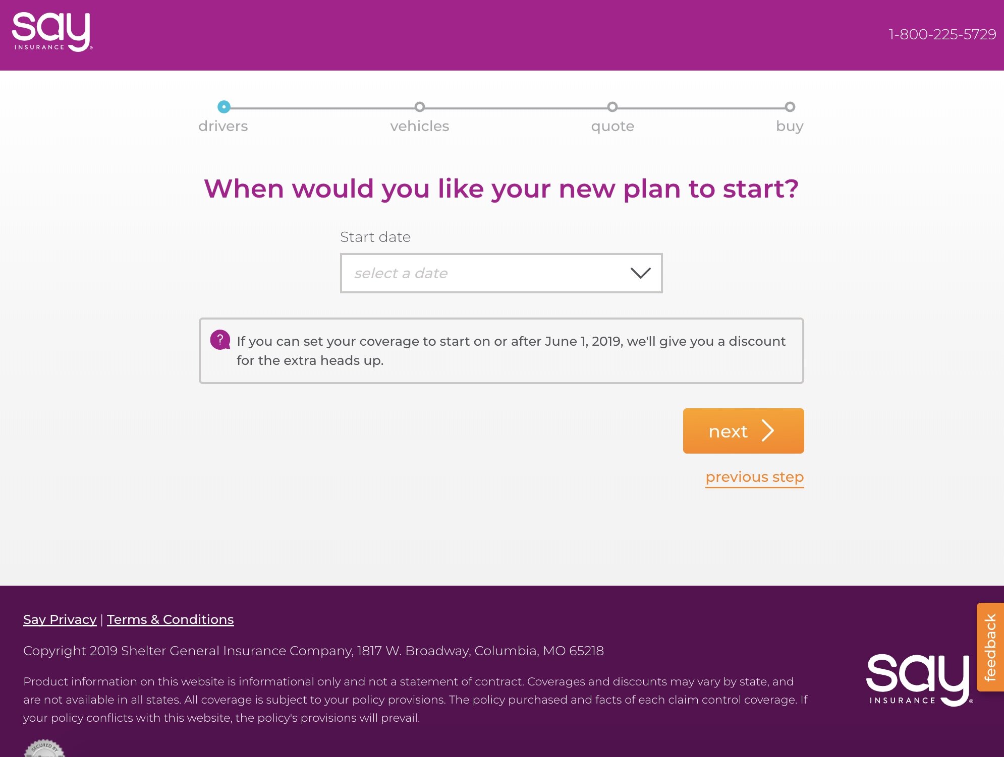
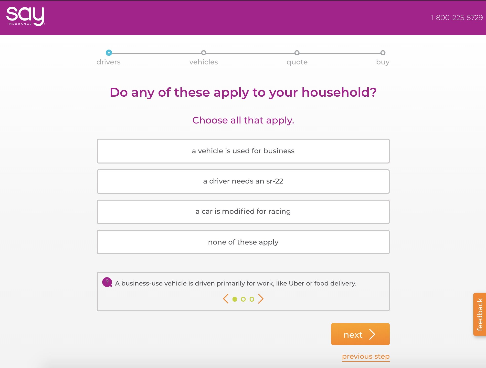
Final mobile designs I created for the hub pages. This is an example of the Drivers Recap page. This design showcases components from the new design system, the updated progress bar, and the new sequencing of the quote flow.

These high-fidelity desktop designs show the quote flow from the starting screen to the first recap page (from the first spoke to the first hub).

These high-fidelity desktop designs show the quote flow from the starting screen to the first recap page (from the first spoke to the first hub).

These high-fidelity desktop designs show the quote flow from the starting screen to the first recap page (from the first spoke to the first hub).

These high-fidelity desktop designs show the quote flow from the starting screen to the first recap page (from the first spoke to the first hub).
These high-fidelity desktop designs show the quote flow from the starting screen to the first recap page (from the first spoke to the first hub).
These high-fidelity desktop designs show the quote flow from the starting screen to the first recap page (from the first spoke to the first hub).

These high-fidelity desktop designs show the quote flow from the starting screen to the first recap page (from the first spoke to the first hub).

These high-fidelity desktop designs show the quote flow from the starting screen to the first recap page (from the first spoke to the first hub).

These high-fidelity desktop designs show the quote flow from the starting screen to the first recap page (from the first spoke to the first hub).

These high-fidelity desktop designs show the quote flow from the starting screen to the first recap page (from the first spoke to the first hub).

These high-fidelity desktop designs show the quote flow from the starting screen to the first recap page (from the first spoke to the first hub).

These high-fidelity desktop designs show the quote flow from the starting screen to the first recap page (from the first spoke to the first hub).
Impact
Since we were redesigning all of the pages in the quote as part of the new design and resulting back-end refactor, I was able to converge the concepts from the design sprint with the output of the design system changes. In creating final visuals and interaction specs, I implemented our newly minted design components from the design system. I also responded to customer feedback by using smaller doses of the highly-saturated brand colors in this project.
Once implemented, this project resulted in improvements to call times in the support center, UI improvements based on user feedback, and resolution of technical and design debt.
Learnings
Sometimes you have to pick your battles, and sometimes it makes sense to fight on all fronts at once. This design solution created a stronger back-end and a more accessible UI while solving the original pain point. The scope increased, but it did so intentionally and the compromises made on timelines were acceptable because of the future efficiency trade-off in design and tech debt elimination.
Stick with one color for interactivity. In this project, orange meant interactive. This was an example of a design constraint that felt restrictive at first, but ultimately simplified the design process and is a reliably clear affordance to a user.